

-
-
3
Notifications View
-
-
CartTotal : 4350.9
-
- 3
-

Wade Warren
UI Designer


Slider
Default swiper slider
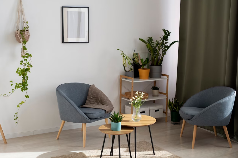
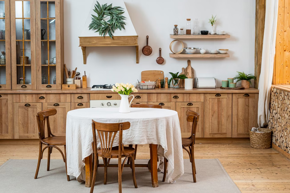
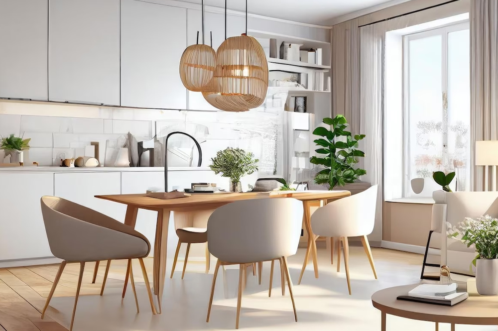
Use the.activeclass and images to prevent browser default image alignment.
With Controls
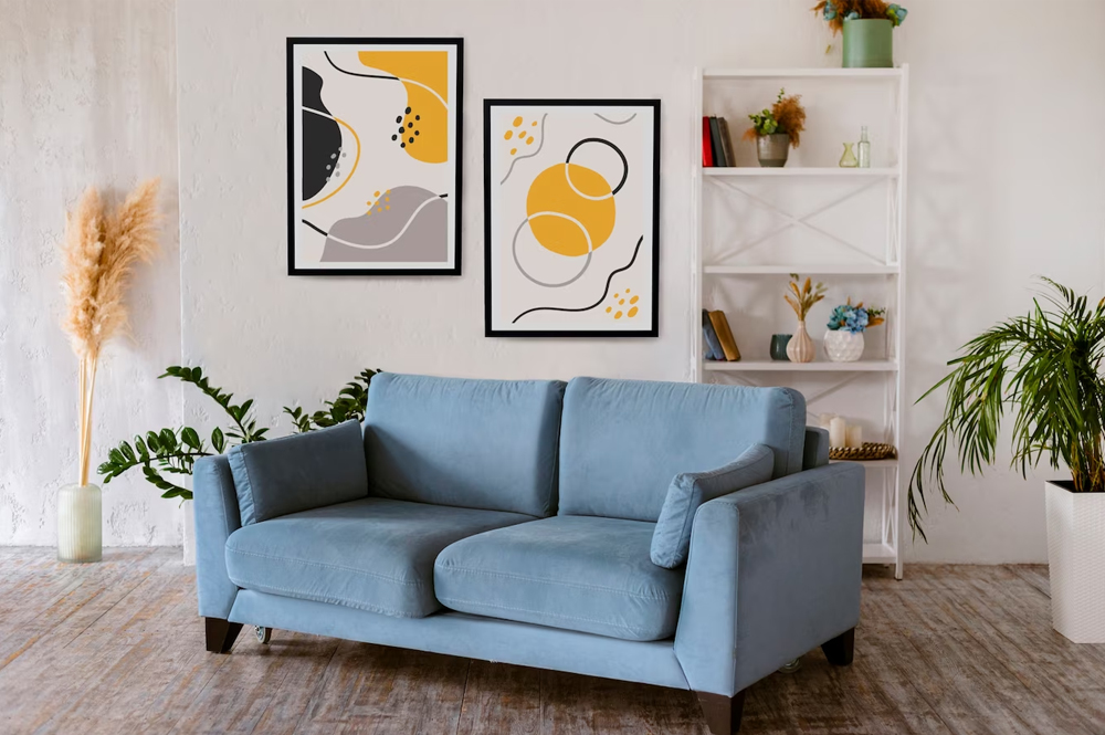
Use the.activeclass and images to prevent browser default image alignment.
Auto Play Variant
Use the.owl-carousethrough slides.
Mouse Wheel Variant
Use the.owl-carousethrough slides.
With Indicators
Use the.carousel-indicatorsthrough carousel indicates.
With Captions
Add captions to your slides easily with the.carousel-captionelement within any .carousel-item.
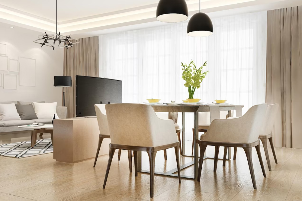
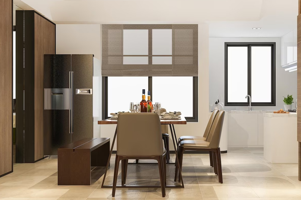
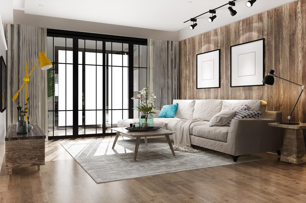
The area in the house that is most comfortable.
You can watch folks you wouldn't have in your house amuse you in your living room thanks to the development of television.
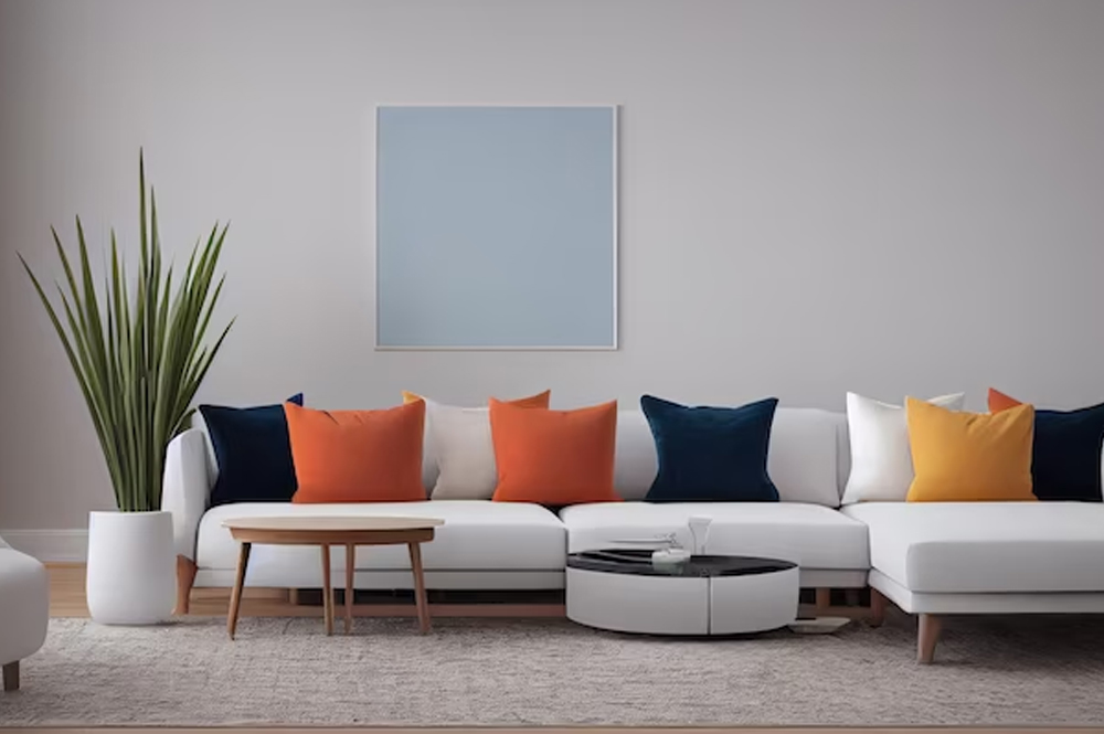
Drawing Room
Regardless of how big or tiny your home is, think about hiring an interior designer. They give you a calm living atmosphere in addition to decorating your home.
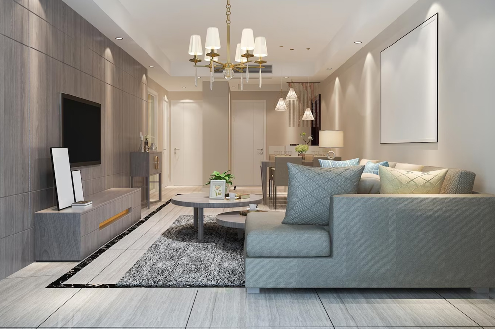
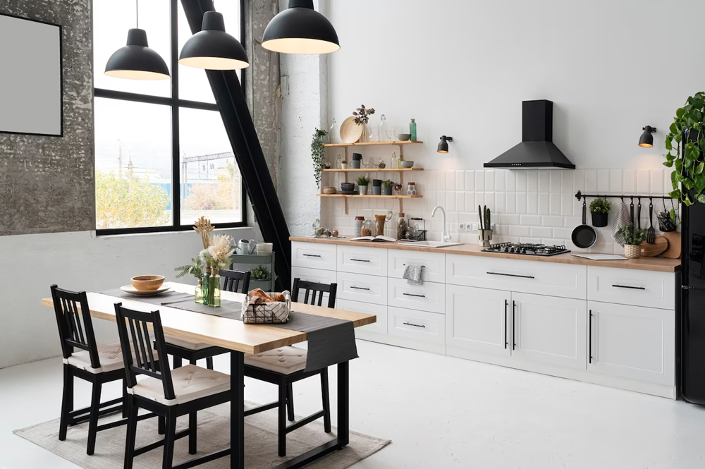
House Interior
If you want to alter your way of life, start with redesigning your house's interior.
Cross-Fade
Add.carousel-fadeto your carousel to animate slides with a fade transition instead of a slide.you may want to add .bg-body or some custom CSS to the .carousel-items for proper cross-fading.
Individual Carousel-Item Interval
Adddata-bs-intervalto a .carousel-item to change the amount of time to delay between automatically cycling to the next item.
Disable Touch Swiping
Use thedata-bs-touchCarousels support swiping left/right on touchscreen devices to move between slides. This can be disabled using the attribute.
Dark Variant
Add.carousel-darkto the .carousel for darker controls, indicators, and captions.
We decorate our homes
If you have been dreaming about bringing your living room together, our designers are here to help. Come see what we can do for your space.
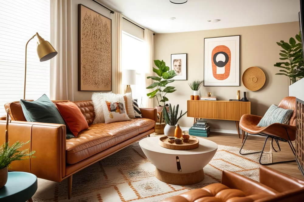
This couch is a great topic of conversation.
A sofa is the ideal spot to enjoy a movie, nod off, and wake up.
Sometimes all you really need to unwind is a comfortable couch.
A house you can create with your friends is a great place.